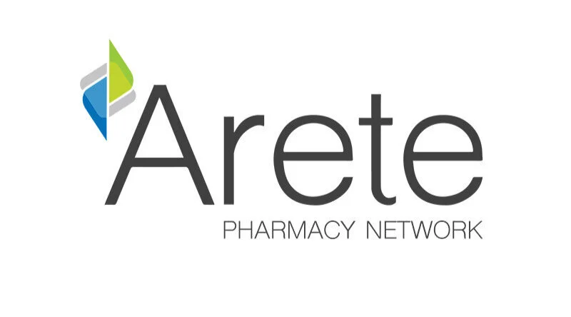
Arete Pharmacy Network
As a joint initiative between two companies in the pharmaceutical industry, the symbol represents the idea of collaboration. Coming together to meet in the middle, each with equal weight - this emphasizes Arete Pharmacy Network’s place in healthcare, as well as partnerships to come with pharmacy networks.

Horace Mann
As the leading insurance provider for educators, Horace Mann’s brand presence was suffering - with their last refresh being in 2004. Working closely with an external agency, I led the creative team in updating the overall look/feel/tone of the company’s brand presence. This included developing and implementing a 130 page brand guide as well as updating over 900 pieces of existing print and digital collateral. The efforts created a cohesive tone and feel which is now in line with Horace Mann’s new brand.
Holzmacher Chiropractic
RH Creative partnered with one of the top chiropractors in Illinois, Holzmacher Chiropractic, to overhaul their brand and create a presence which emphasized health, wellness and a preventative approach. The logo is designed to demonstrate the root of a problem and the possible outcomes through growth.